One of the things we’ve talked about a lot in our class is how historiography (the study of how history is written) can help us understand why certain stories get told and certain ones don’t get told—or wait for a much longer time to be written and disseminated.
Implicit in this conversation has been the idea of popularity and of audience. The imagined or projected audience—plus their interests and frames of reference—can often mean the difference between a book having a 500 copy run and relative obscurity, versus a 100,000 copy printing that gets marketed widely… and maybe even becomes a film or television show.
For this exercise I’d like you to think about the historiographical difference between a history being locked inside a book that relatively fewer people read versus being made into a more widely-consumed format like a graphic novel. How does each format change the story being told and serve the audience (or different audiences)? What does the study of how history is written have to teach us about making a traditional text into a graphic novel or comic? Why might this format shift might be very important not only for how the story is told, but how that history actually effects broader changes in how people understand the world around them?
For the comics assignment, try to come up with a one-page or even one-panel interpretation of one point or insight from a book we’ve read. You don’t have to be good at drawing and if you want you can even describe the layout of the comic instead of drawing it. You are also welcome to use stick figures, or a mix of photo collage and text, to try to convey your point. Check out some examples students did from a similar assignment here. You are welcome to do this on paper or using software—there are some apps online that provide comics templates and tools that you might find helpful (search for “comic maker” or “comic strip maker”).
Some possible examples to get you started:
How would you represent the crux of the generational conflict between the father and son from Think Black in a one-pane comic? How would you boil down the most important insight about this conflict into text short enough to fit in two speech bubbles (one for each person) or in one caption?
How might you draw or trace a picture of Hazel Carby, or her father, and then use that image to create a cartoon that shows the racism inherent in the question “where are you from?” Could you make a one-page, 2 to 6 pane comic about this? Or describe how you would do this, and how you would like for it to look, even if you can’t draw it yourself? Think about how the drawing itself could convey certain messages even before you add text. Could you convey your point with pictures only? Pretend you have an artist who will draw it for you as long as you describe it in specific enough detail.
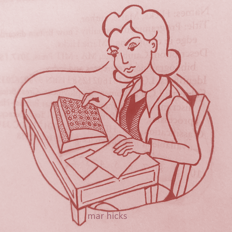
How could you use a camera or photocopier on a few of the many images in Programmed Inequality to create a one-page, 3 to 6 pane comic where you didn’t have to do any drawing? Could you represent the book’s main argument or would it be better to focus on one incident or insight from the book that you found interesting? You could write your own text or cut and paste text from the book, or both.
How would you use Her Neighbor’s Wife to make a comic that comments on LGBTQ history and historiography? Could you create a short (maybe 3-pane) comic that highlights who is missing from mainstream LGBTQ histories that focus on political activism?
This assignment is now optional due to the COVID-19 pandemic, with a flexible due date of April 6 through 10th. If you do choose to do it, pass it in by sending it to me by e-mail.
Note: One of the pieces you read for this week, Marjane Satrapi’s Persepolis, started as a graphic novel and then was adapted into an animated film. Listen to this interview with the author about that process: “There are many other realities that you do not see” –Marjane Satrapi
Comics produced by class members:
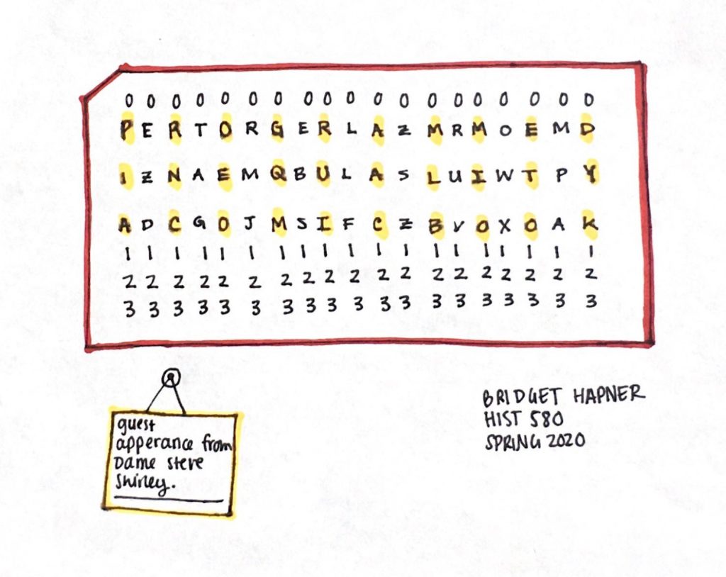
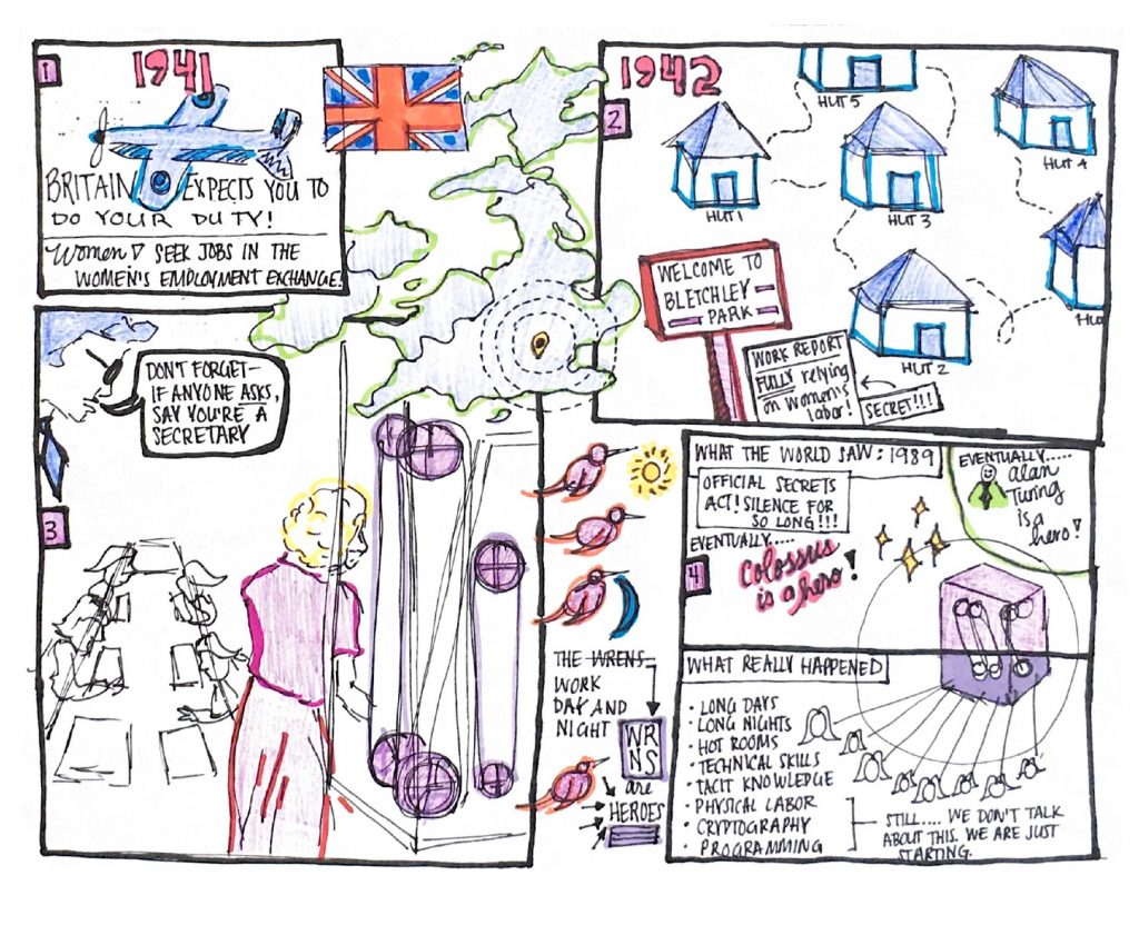
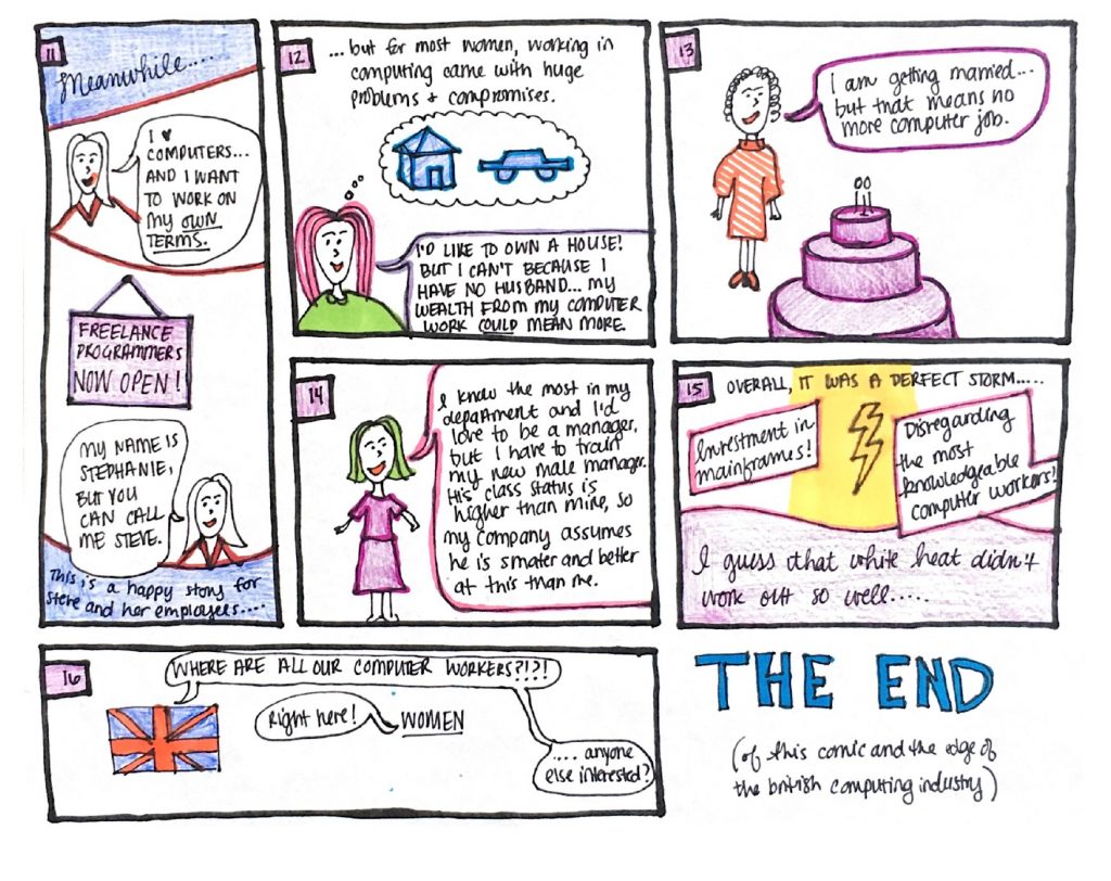
Below is a 4-page comic based on Programmed Inequality, and the oral history of Steve Shirley that you listened to, drawn and written by class member Bridget Hapner (click on each image to see it larger):
